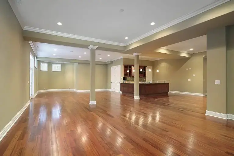
Choosing paint colors is probably the number#1 challenge faced by people looking to paint their homes, both inside and out. There are so many choices and so many opinions about what looks good that it often leads to indecision and second guessing. Colour issues are important because they affect how an entire room feels, and this can make people passionate about their unique preferences, and their opposition to other preferences. All this is why the better you are at choosing house paint colours, the better your house (and home life) will be. But as you’ll see, there’s more involved here than just personal choice . . .
Choosing Paint Colors: Feelings vs Logic
Paint colors are all about emotion. “Feeling good” is, in fact, the main reason people paint in the first place. Shade, saturation, value and colour temperature all work together to set the tone for any space. The thing is, almost no one has anything more than the most primitive understanding of colour. The last time most of us had any formal colour education was probably back in kindergarten when we were learning what names different colours have. A child’s understanding of colour isn’t enough to support the decisions that an adult needs to make before house painting, and this is one reason there’s so much frustration, indecision and bad colour choices in the world.
Another issue is that homeowners want to add colour to their lives, but they usually can’t visualize the results. With hundreds of thousands of paint colours to choose from, and no guidance for choosing except “pick what you like”, it’s no wonder so many people have trouble. The good news is that there are useful guidelines for choosing colours and they can help when it comes to selecting paint.
Your goal in all this isn’t to become a full-fledged colour designer, but rather to equip yourself to choose colors intelligently. A little knowledge goes a long way. Here are three steps for choosing better household paint colours:
Choosing Paint Colors Step#1: Identify objects that will be in the room
“It’s the stuff that’ll be in a room that should determine paint colours,” explains Len Churchill, a commercial artist and friend of mine working in Markham, Ontario, Canada. “When I’m choosing residential colours, I look for options that change throughout the day, depending on natural lighting. Grays and taupes are great for this. People these days expect to live with a paint job for a long time, so it’s worth the trouble of choosing well.”

Effective digital tools now exist to allow colours of fabrics, window coverings, trim, furniture and anything else to be sampled, recorded and used later to find paints that match. Something called the Nix Mini Color Sensor (www.nixsensor.com) is a small (very small) wireless device that works with your smartphone to let it “see” existing colours and offer colour suggestions. It’s the best of its kind I’ve used so far and it’s not too expensive – $100 online from the manufacturer.
Besides helping you make better colour choices, the Nix Mini is exceptionally easy to use. Charge it with a USB cord, download the app, then pair the Wix and your phone wirelessly. Any time you want to record an existing surface colour as a basis for choosing paint colours, just place the Wix eye-side-down, then hit the scan button on your phone. In a second or two the colour will be scanned and recorded, with colour suggestions automatically generated. You can share these colours with any other phone, you can choose from many different paint manufacturers and see their corresponding paint chip numbers and paint availability online. Look further into the app and you’ll find colour suggestions including monochromatic, complementary, analogous, split complementary and triadic. More on color theory later in this article.
Choosing Paint Colors Step#2: Use a colour wheel to guide you

The colour wheel is a small, hand-held tool that identifies which colours go well together. Most people are surprised to learn that there’s math and logic behind which colours look good together and which don’t. It’s not random and it’s not just a matter of personal taste. The colour wheel makes it easy to identify colour harmonies and communicate them to other people in the house with a sense of authority. I bought the one you see above from Amazon. Here are the basics:
Complementary colors: These are completely different colours that go well together. Colours 180º opposite each other on the colour wheel are complementary and they harmonize visually. Three main, primary complementary colours that go together in this way are yellow & violet; blue & orange; red & green, for example.
Split complementary colors: Choose a color, look at the opposite on the other side of the wheel, then look again for the colours flanking those opposites. These are what they call “split complementaries” and they offer more variety than just straight complementaries.
Analogous colors: Three colours next to each other on the colour wheel are closer in shade than complementaries, but they still look good together, too.
Monochromatic color: This is an approach that uses one colour, but a single colour doesn’t necessarily mean just one thing. Choosing variations of saturation and color value can add interest to a space while also making the effect quite visually cohesive. A monochromatic colour scheme would use different colours from the same paint strip.
Triadic colors: These appear 120º apart on the colour wheel.
A surprising number of people don’t pay attention to the annual colour choices published by paint companies, but that’s a mistake, especially if you’re fixing up a house to sell it. A few years ago, for instance, DULUX Paints named Night Watch (DLX1145-7) and Mojito Shimmer (036VS) as colours of the year. One nice thing about trending colours is that they usually come as a collection of colours that go well together. Night Watch, for instance, is officially recommended to go with the sandy beige colours Elusion (DXL1005-2) and Earthy Can (DLX1103-4) or Lucky Penny (DLX1201-7).
Choosing Paint Colors Step#3: Always Test Colors First
“I always put paint samples on walls in one way or another”, explains Len Churchill, that commercial artist friend of mine that I told you about before. “I work with colour every day, but I never choose only from a paint chip. Color choice is a mood thing, too. The way you feel about a color one day isn’t necessarily the way you’ll feel tomorrow. That’s why I always suggest that people live with test patches on walls for a few days. Cool colors make small rooms look larger, and warm colours make large rooms look cozier and more inviting.”
Choosing Paint Colors: Wisdom from an Old-School Painter

Paul Tyzek has been adding more than the usual amount of color to buildings all over Winnipeg, Manitoba, Canada for 20+ years, and he’s had a lot of practice leading clients through the colour-picking process. That’s Paul on the ladder above. “It’s not so much that people fear choosing colours,” says Paul, “but there’s a widespread inability to visualize colour ahead of time. Most people can’t eyeball anything useful from a small paint sample, either. Many folks are friendly to the idea of testing paint on an actual surface. As a professional painter l also try to avoid liability by using a certified designer or architect on large or complicated projects.

I also provide feedback on color choice and any additional labour requirements that a certain tint or finish might involve. Challenges with colour usually arise from lack of co-ordination, lack of research and uninspiring conventionality”, says Tyzek. “Google image searches offer a helpful and convenient way to get colour ideas. I always stay sensitive to an owner’s colour palette and the subjectivity involved in tint selection. The challenge is in finding tasteful solutions. I like to say there are no “poor choices”, just better ones! Diplomacy and psychology do factor into things for me. “Keeping up with the Joneses” is also an issue. As houses in a given neighbourhood trend away from the traditional exterior, colours exert a certain pressure for one-ups-man-ship when it comes to painting.
A square of painted drywall moved around the room makes it easier to get the big picture, especially under different light conditions. It’s all about angle of light, intensity of light and colour of light. Painting and repainting the same pieces of drywall lets you try different options as you home in on the ideal choice. Most people live with paint colours for a long time, so a little investment of time up front makes sense.
Are you interested in white? White is unique among paint colours for a couple of reasons. It’s a fabulous and classic option because it goes with so many other colors, and is especially attractive in a room with dark trim and wood floors. Realtors often recommend white paint for selling homes since it appeals to the widest cross section of the public. The thing is, not all whites are created equal. In fact, choosing the right white can be tricky. The issue comes down to hue and tone, but this isn’t necessarily easy to see. Different whites only look different when compared with other whites. There are many whites out there, some warm, some cold, and some in between.
Choosing Paint Colors: How to Use the 60/30/10 Rule
This simple, time-tested colour choice strategy helps create a balanced colour theme in any room. Here’s how it works:
- Primary colour: About 60% of the surfaces in a given space should be the same colour. This primary colour is what you’ll find on most wall areas, area rugs, large pieces of furniture, etc.
- Secondary colour: About 30% of the room should be a secondary colour. This should have some relation with the primary colour (complementary, split complementary, analogous, etc.)
- Accent colour: About 10% of the room should be a kind of visual spice – different from the primary and secondary colours. This could come from paint, but you might be able to get it with decorator pillows or painted furniture, too.
Want to become a better DIY house painter? Click here for five tips from professional painters.
Need help patching those interior walls so they’re smooth and nice before painting? This is key. Click below to check out my online video course about interior wall patching and preparation.


