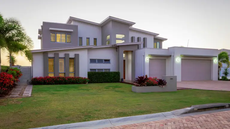
In our fast-paced world, our house becomes the place where we restore and rejuvenate ourselves. That’s why it makes sense to make your house truly your home. You have to give your place the right feeling and flavour of décor to make it ‘YOUR’ place, plus other people will enjoy it, too.
Apart from making it beautiful, adding and investing in the decoration of your place can have different benefits. This can raise the market value of your place and even lower your insurance rates in some cases. Some things that can act as home improvements to lower your insurance premiums, are upgrading your roof, or installing a home security system. This not adds to your home beauty but can increase its value and curb appeal.

To quote Dorothy from Wizard of Oz, “there’s no place like home.” That’s why it’s crucial to ensure that your home is beautiful and vibrant. Here are 6 common mistakes you might be making that harm your home’s beauty.
1. CHOOSING THE WRONG COLOR FOR YOUR ROOMS
Color psychology is a vital aspect of interior designing and the beauty and comfort that your home exudes largely depends upon it. It affects us in various ways- our energy levels, mood, and sleep patterns. Let us see the best colors to paint your rooms:
The best colors for bedrooms include light shades of blue and green as they instill a sense of calmness and tranquility which in turn helps provide a nurturing environment.
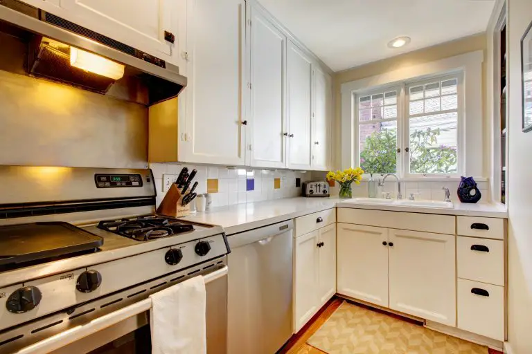
The worst colors include red, orange, and yellow. Red induces a fierce and passionate ambiance, orange serves exuberance and vigor- best meant for exercise rooms. Yellow is a warm, cheerful color that enhances appetite, thus, unsuitable for bedrooms but an ideal choice for kitchens.
The most popular colors for living rooms right now are green, grey, or navy. Green and blue can be refreshing and subtle at the same time. Grey or beige is elegant, chic, and a great option for those who love neutrals. You can also make a dramatic statement with red or yellow which will infuse intensity, zeal, and vigor into the surroundings. Just be careful with red. It’s a powerful choice.
2. FURNITURE MISPLACEMENT
Along with an appropriate color for a room, furniture accentuates the beauty of the room. The arrangement of furniture should be in such a way that it looks appealing and does not cause obstruction in ease of movement. However, the most common problem is decorating with either too much or too little furniture.
Too much furniture can make a room appear cluttered. Too little can make it dull, bland, and drab. Sofas, tables, chairs, and beds should work well with wall colors. Never push furniture right up against walls. Instead, try to keep it a few inches away from. Besides not scratching your walls, a little space makes for intimacy and creates a well-balanced and inviting space.
Avoid keeping furniture that covers windows or other means of ventilation at all costs. A good flow of fresh air and natural light is absolutely necessary for growth and comfort. You never want to lose that because of a high-backed couch that partially blocks the windows.
3. TOO MANY PHOTO FRAMES
Displaying your best memories in the form of photo frames is what transforms a house into a home. However, too many photos spread all across the home, in bedrooms, living, and dining rooms can seem tacky or obtrusively showy. The best solution for this issue would be a gallery wall. When decorated in the right way with shapes, sizes, and aesthetics, photos and artwork can enhance the overall look of the room.
4. USING TOO MANY COLORS AND PATTERNS
Colors and patterns provide a great medium to channel one’s creativity, but when they don’t complement each other, it might seem overwhelming and chaotic. Do not choose contrasting and different colors for each room. Instead, try to blend and connect all rooms with a color scheme that binds them into harmony.
Rules are simple, and hues belonging to the same tonal family work well with each other. When a complex pattern is being used on say a fabric or furniture, try to complement it with a simple pattern elsewhere in the room to avoid it producing a jarring effect. There are even devices for your phone that can read colour and make mathematically harmonious colour suggestions.
5. HANGING CHANDELIERS AND PENDANT LIGHTS TOO HIGH OR LOW
Chandeliers and pendant lights can give a grand outlook to a space. They add royalty to a room but a chandelier that is hung too high or too low can interfere with the room’s aesthetic.
Hence, one should be aware of the correct height measurements to hang such light fixtures to maximize the beauty of the room. Ideal measurements for 8-9 feet high ceilings are 70-80 inches from the floor/30-36 inches over a table.
6. A CLUTTERED HOME
Even a well-designed home can seem unattractive if not maintained. Clutter can accumulate quickly so it’s imperative to clean and clear up your house every day as it can lead to bad impressions on anybody who visits your home.
Make your bed first thing in the morning. Use storage units, organizers, and cabinets to store items to clear up the area. Restrict yourself from resorting to impulse buying. Tidy your home every day. Numerous home design innovations will help you maintain your home easily and efficiently.
CONCLUSION
Home design might seem tricky or complicated at first, but all these rules and tips are for the betterment of your home so you can derive the most out of it and pleasure always surrounds you. With that being said, do not stop experimenting with various styles, colors, and patterns, and keep those creative juices flowing!


I hope you found this content useful!
Your generous support helps me produce more practical, hands-on content that I hope you’ll find useful.
Steve Maxwell